Madd Movies - UX Case Study
An accessibility-focused movie ticketing experience designed for users with low vision and dyslexia.
UX Designer
Category
Entertainment Tech
Duration
Apr 2022 - Aug 2022 | 4 months

Overview
Background & Motivation
My interest in human-centered design comes from my sister's experience with dyslexia and low vision. Watching her struggle with everyday apps motivated me to design an experience that prioritizes accessibility and independence.
Problem
Many movie ticketing apps rely on small text, unclear icons, and visually distracting interfaces with poor color contrast. These design choices make it difficult for users with low vision and dyslexia to read content, navigate independently, and complete a purchase without assistance or switching to another device.
Solution
MaddMovies is an accessibility-focused movie ticketing experience designed to support users with low vision and dyslexia. Through improved readability, consistent navigation patterns, clear visual hierarchy, and accessibility features such as tap-to-zoom, dark mode for less eye strain, the app enables users to browse and purchase tickets with greater independence and confidence.
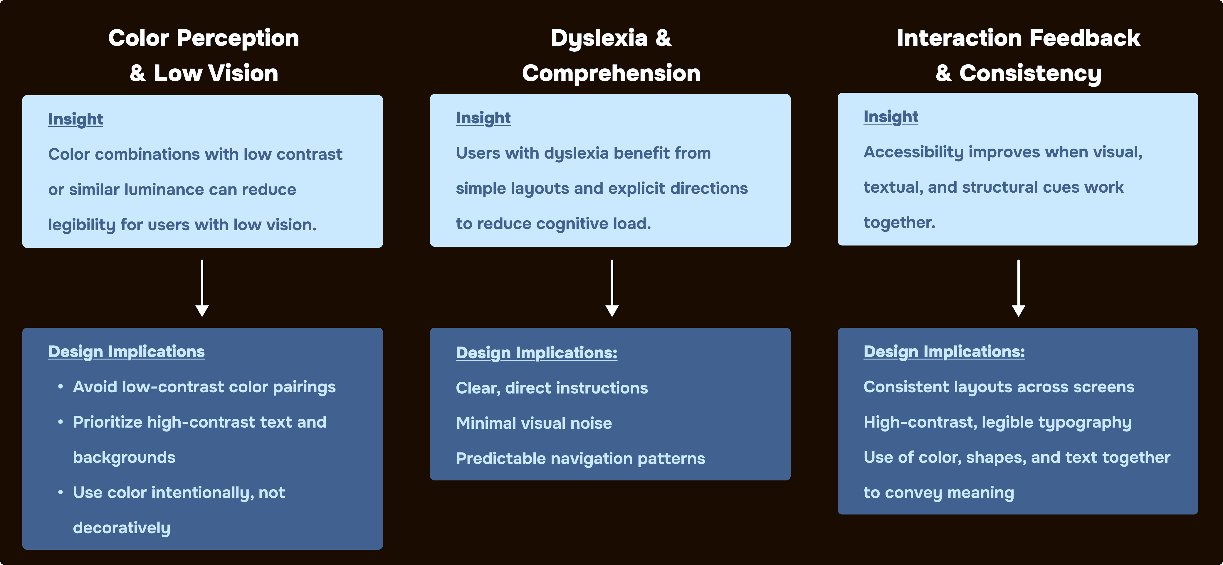
Research & Analysis
Research was conducted to better understand how visual impairments and dyslexia influence the way users interact with digital products. The findings informed key design decisions related to color contrast, navigation, readability, and interaction feedback.
Why Accessibility Matters
Approximately 14-43 million people in the U.X experience dyslexia
Over 14 million people live with significant vision impairment
A significant portion of users rely on visual aids or accessibility accommodations
These findings reinforced the importance of designing for accessibility, particularly for users who regularly encounter barriers when interacting with digital interfaces.
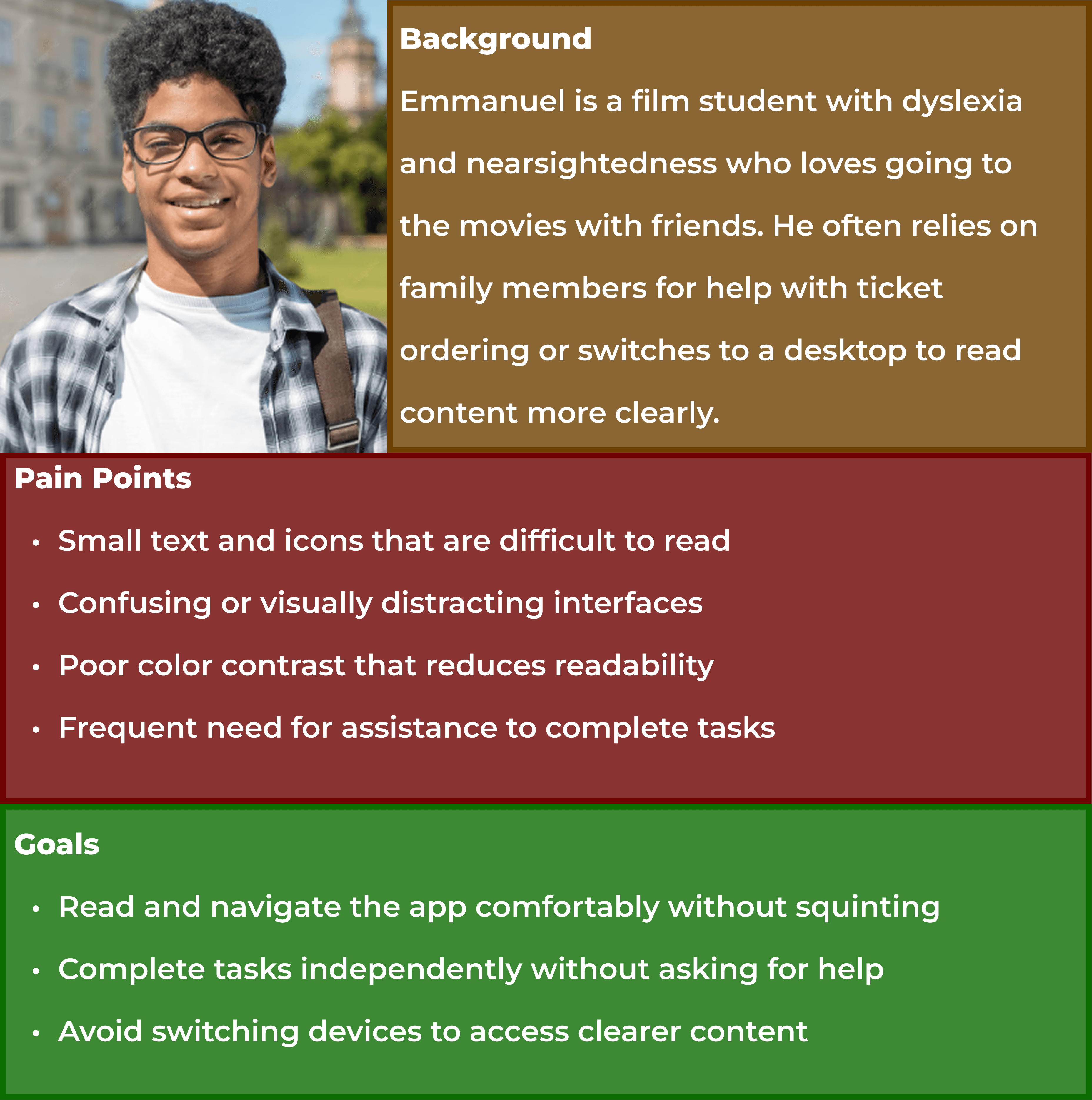
User Persona
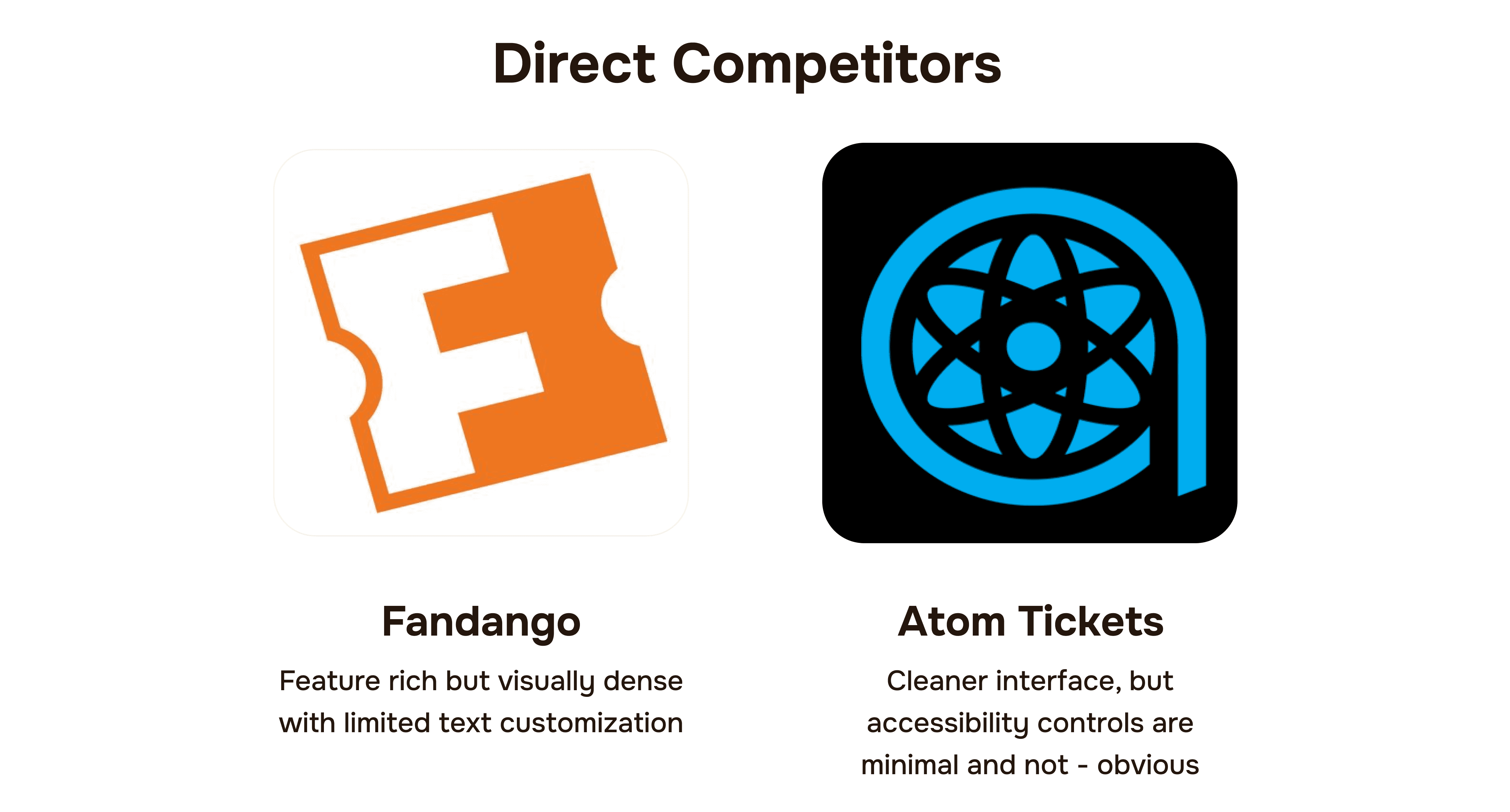
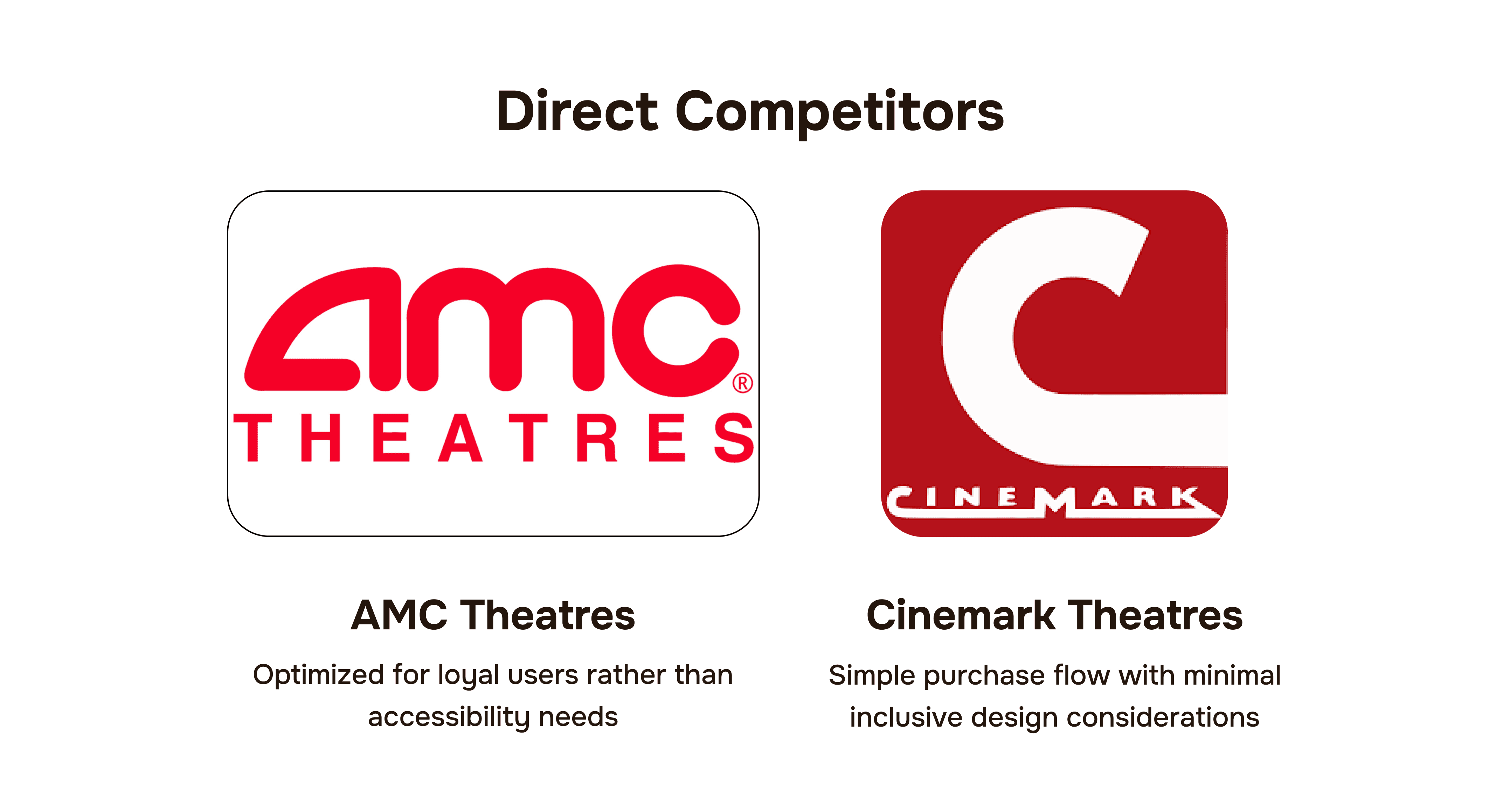
Competitive Analysis
I analyzed existing movie ticketing apps to understand how accessibility is currently addressed and where gaps exist for users with low vision and dyslexia.
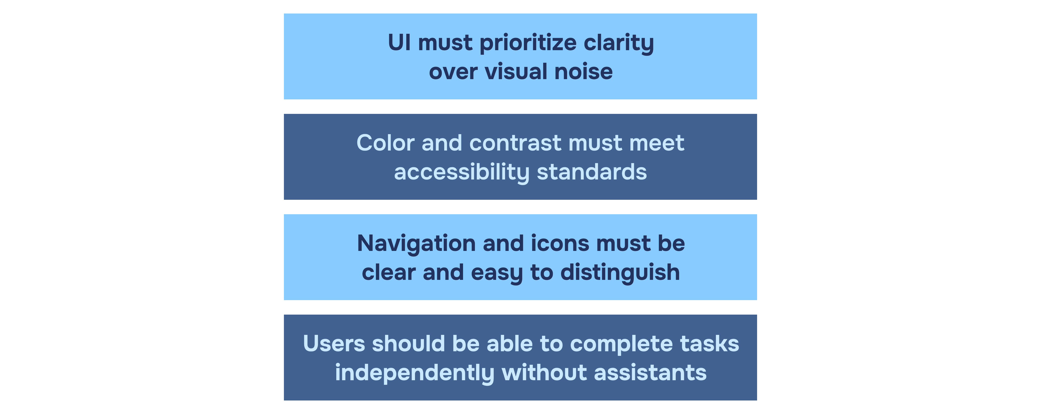
Design Direction
After analyzing the data, I realized these were the most important things to keep in mind when designing the application.
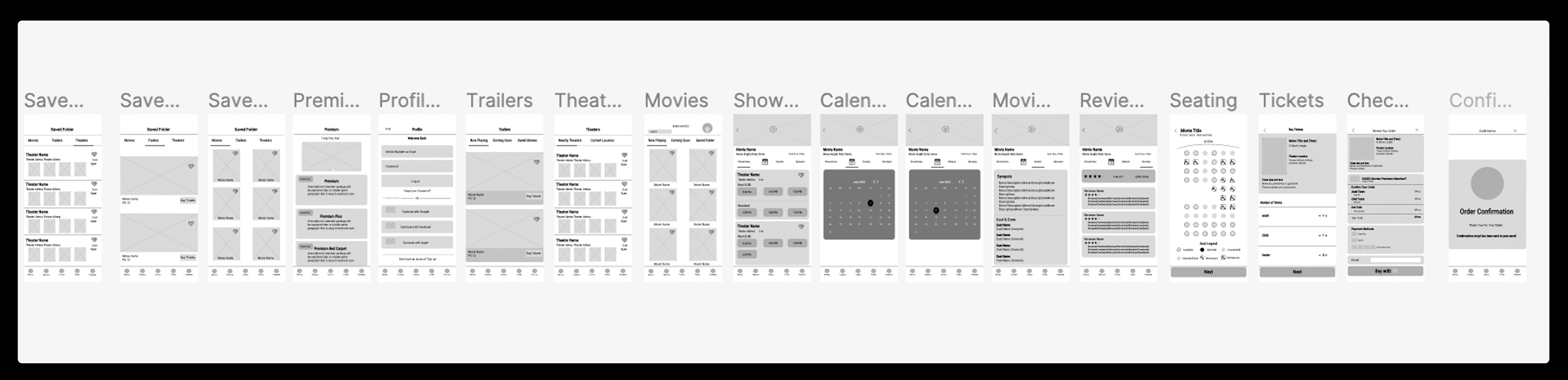
Wireframes & Crazy 8s
Early concepts were explored through rapid sketching to evaluate multiple approaches before moving into digital wireframes.

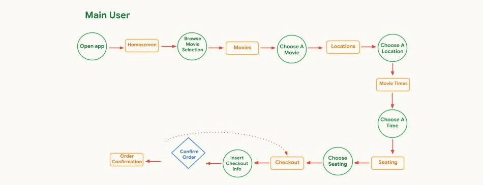
User Flow
Low Fidelity Prototype
Testing Results
Affinity Map
After two rounds of usability testing with five participants, findings were synthesized using affinity mapping to identify key themes and insights.
Key Findings
Final Design Guide
Style Guide
Design Iterations
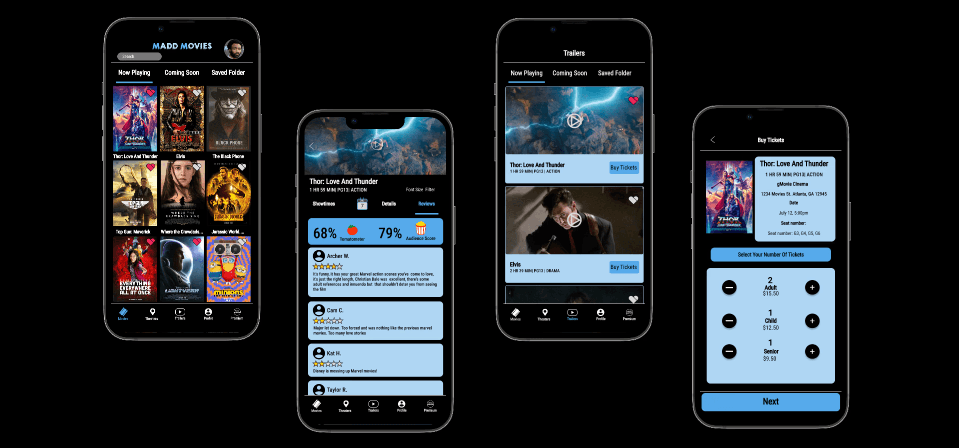
Tap To Zoom Feature
To support users with low vision, a tap-to-zoom feature was introduced, allowing text to be enlarged with a single tap and returned to its original size when no longer needed. This provided users with greater control over readability without disrupting the overall browsing experience.

Final Prototype
Final Prototype
To improve navigation and orientation, active navigation states were highlighted in blue throughout the experience. This clear visual feedback helped users identify their current location within the app, reducing confusion and making it easier to navigate between screens with confidence.

The final solution combined accessibility-focused design principles with iterative user feedback to create a movie ticketing experience that prioritizes readability, navigation clarity, and user independence.
Reflection
MADD Movies is personal to me because it helped me think from the perspective of my sister with visual and cognitive challenges. This project pushed me to prioritize clarity and usability over aesthetics to reduce mental load every step.
If I had to improve the design, I would expand tap-to-zoom to more screens and expand accessibility features through trailer captions and additional viewing accommodations
Overall, this project strengthened my understanding of accessibility challenges and reaffirmed the importance of designing with empathy and inclusion.